During my internship at Cartier Création Studio (Département Création Horlogerie), I was tasked with designing a complete visual identity for a new sports watch model targeting young adults aged 18–25. Starting from a thorough analysis of Cartier’s brand image, I developed two alternative logo concepts using typography as the central design element, alongside the full packaging, showcase display strategy and advertising campaign for the launch.
This project was presented directly to Cartier’s marketing department manager.
Internship · Cartier Création Studio · Geneva · 2014
Typography

Project 1 / Logo
Taking inspiration from the name "RONDE", I built the logo concept around the idea of roundness — designing a mark that works on two levels simultaneously: as a visual symbol and as a typographic word. The letterforms and the circular form reinforce each other, creating a cohesive and instantly recognisable identity.
Project 2 / Logo
The Ronde Solo's hands are its most distinctive feature. Rather than treating them as a purely functional detail, I transformed their precise, geometric silhouette into a graphic element — using the hands as the decorative border motif of the watch packaging, turning a technical element into a signature design detail.
Graphic elements

For the Ronde Solo packaging, I reimagined the traditional Cartier red box by replacing its classic border with a custom graphic element inspired directly by the watch's hands. Their symmetrical, precision-engineered silhouette was transformed into a repeating motif — turning a functional watchmaking detail into a distinctive packaging signature unique to the Ronde Solo.
Packaging detailed below:


Color palette


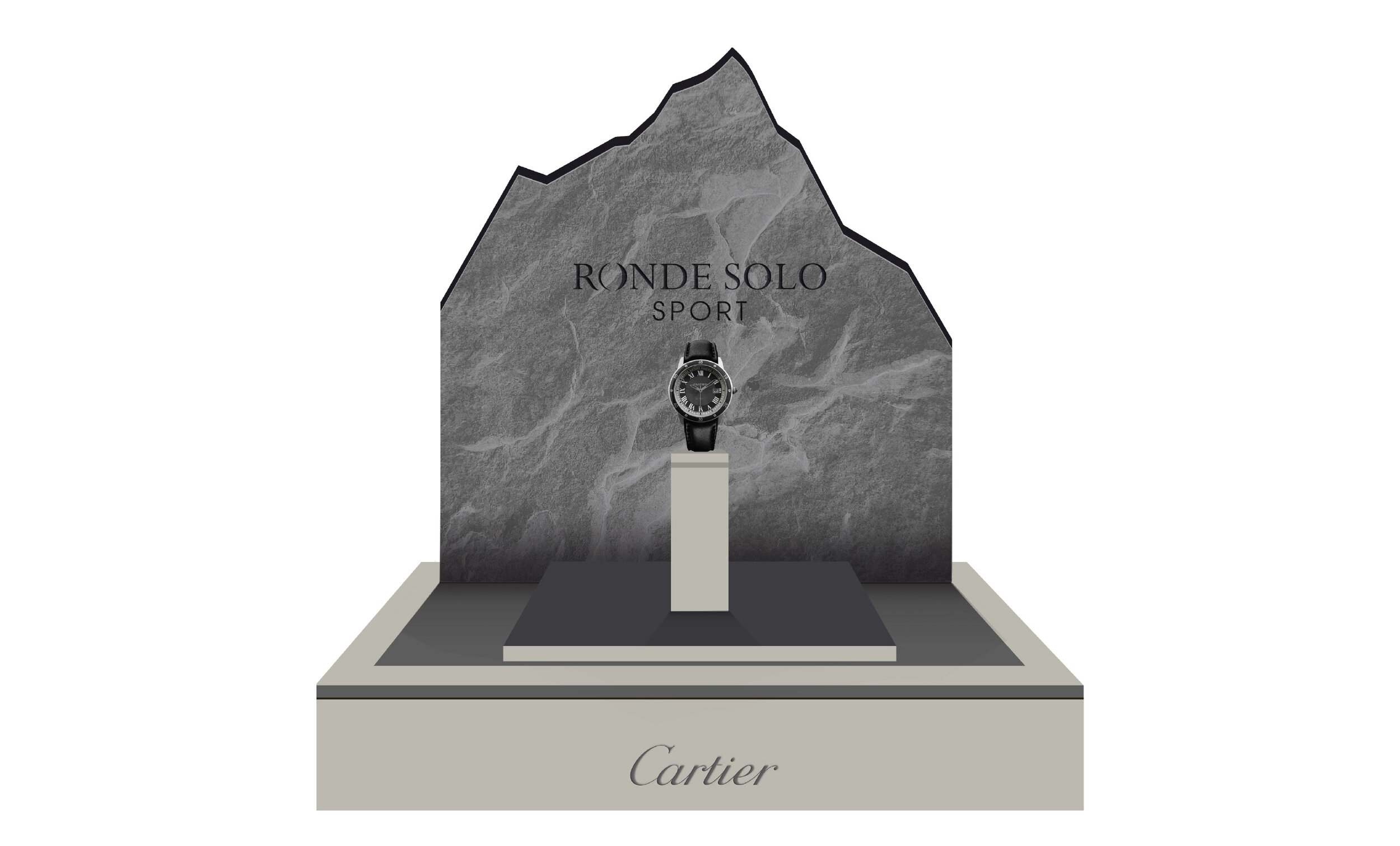
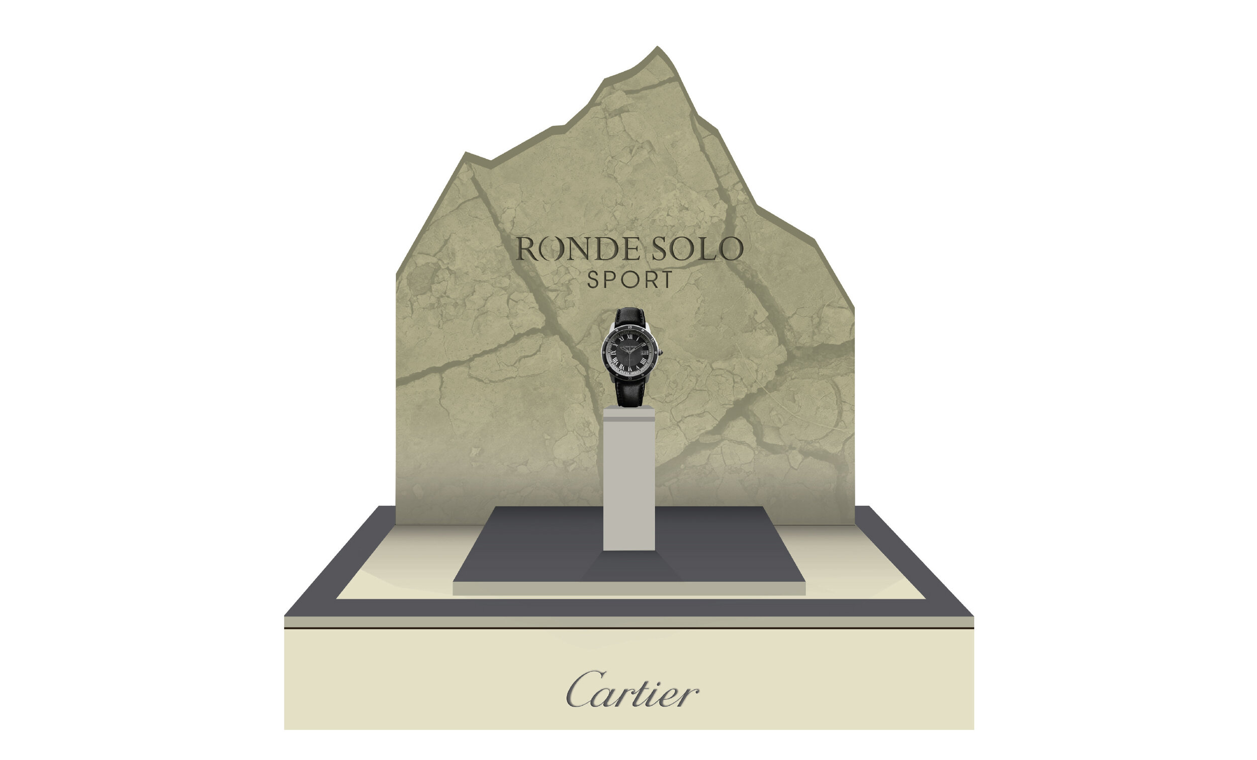
Showcases